
Crawford's

This is 233 High Holborn, rather ordinary looking now but once "a pioneer work of the Modern Movement in England, the office block has good claim to be the first office block in England inspired by the International style." (From its listing).
It used to look more like this:

The architect was Frederick Etchells, once a Vorticist, later a restorer of churches. It was built, in 1930, for Crawford's Advertising Agency, perhaps the first British advertising agency to truly embrace visual design, echoing modernism and futurism and for many years the home of the legendary Ashley Havinden.
He did this:

And this:

But he is perhaps most famous for being the 'creative director / designer' behind almost all of the advertising for Simpsons and DAKS, one of the first examples of a comprehensive corporate identity - which Havinden called 'company handwriting'.*
The boss, William Crawford was, for his time, an enlightened employer of women saying "in no other occupation can men and women work together in closer harmony than in advertising". He famously employed the Sangster Sisters - Emily, Florence and Margaret. Florence was Managing Director and Finance Director, Margaret started as an Account Director and ended her career as a prominent figure in the history of British fashion, first Chairman of the Incorporated Society of London Fashion Designers.
So there we are.
Most of these facts and gleaned from 'Moving the Hearts and Minds of Men' Bill Crawford Ad Man by Ruth Artmonsky.
(*Also employed by Crawfords to work on Simpsons - Feliks Topolski.)
One more thing
I wrote some blog posts about doing presentations.
Organise it so people can follow it
Do those right and I think you're 90% of the way to doing a decent presentation. But, I got a few questions about 'visuals' so I thought I'd write one on that. Mostly because it's really easy to undermine a good presentation with a pointless transition.*
I'll confess, this is mostly just a list of things that irritate me.
Illustrate Don't Decorate
You should use visuals to make the point you want to make, not to make it look 'more whizzy'. Your visuals should be big and clear, just like your words, you should not have any visuals that aren't helping you communicate.
Specifically:
If you're talking about budgets you don't need a picture of some money.
If you're talking about having ideas you don't need pictures of lightbulbs.
If you're talking about teamwork you don't need a picture of some brightly coloured people holding a piece of jigsaw.
Even more specifically, never, ever use clipart.
Similarly, if you're typing an abstract noun into Image Search you've already lost.

Instead...
Show The Thing
If you're talking about something - show it, show a big picture of it. Bring it to life. For us this often means showing a demo, or a video of someone using The Thing.
This is useful discipline. Because if you show it, and it doesn't explain itself, there's probably something wrong with it.
One thing from tonight's @undermanager talk at #Firestarters has lodged in my brain and is totally taking hold. pic.twitter.com/Cgwll0EEb1
— Chris Thorpe (@jaggeree) March 3, 2014
If you're showing software or a website, remember - no one needs to see all the chrome and the tabs in your browser, and you'll probably need to zoom in to show the essential details. This stuff isn't designed to be shown across a room.
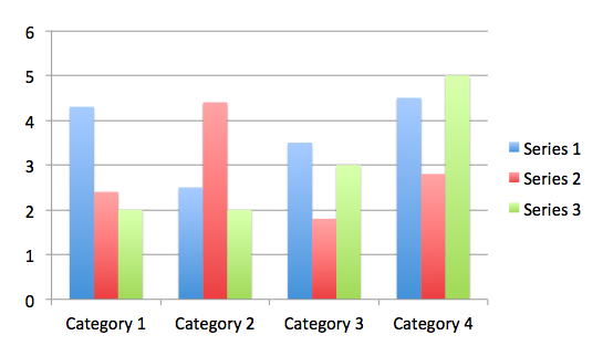
No 3D
3D graphs are harder to read than 2D ones. Don't use them. PowerPoint defaults to them, so you have to work a bit harder. But it's worth it.
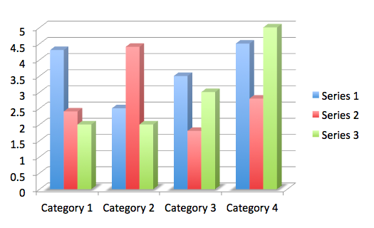
 Ideally I'd get rid of that graduated fadey colour effect in the bars too, but I just can't work out how.
No Pie Charts
Pie charts are notoriously hard to read. Don't use them. They're even worse if you make them 3D. Unless you're actively trying to mislead people...
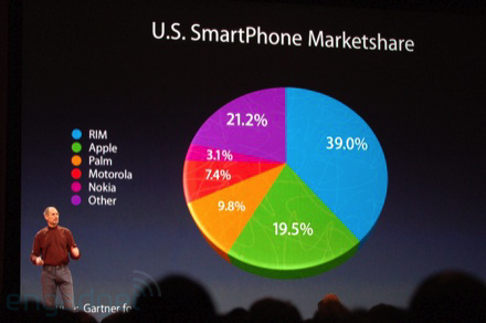
(See how much bigger Apple's 19.5% is than Other's 21.2%)
Having a diagram doesn't make it clearer, making it clearer makes it clearer
If you've got a lot of complicated stuff to communicate don't just reach for a diagram. The chances are you'll just make a complicated diagram.
*NB: all transitions are pointless.


Software Above the Level of a Single Man
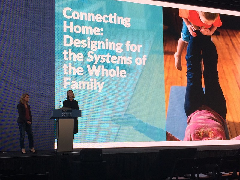
Anna Shaw and Murphy Freelen did a presentation at Solid which should not have been eye-opening for me, but was. They pointed out all the various ways that new Internet of Things / home technology products fail to take account of the fact that most homes are occupied by messy things like families, guests, friends and flatmates and are less frequently occupied by Single (white, straight, young, able etc) Men with high disposable income and lots of bandwidth.
This is, of course, not a new technology phenomenon and is normally addressed by everyone else just trying to live with whatever the Single Men come up with.
I shouldn't have been surprised by this because I deal with it all the time. I'm in a family lucky enough to have an xbox, Apple TV, iTunes, Spotify and a Nest and I'm fully aware that making them work for more than one individual is pretty hard - and I'm the one individual. And they've been working on this stuff for years. And it's still mainly on screens you're supposed to be in the room with.
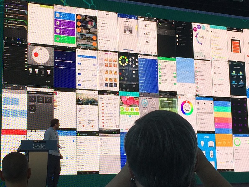
Designing for the complex and shifting power and permission relationships inside the average family is going to be a massive issue. Think how hard it is to explain to a visitor how to control your slightly-smart TV and your Sky box, think about all the notes you leave around the place pointing at remote controls and wifi passwords and multiply that by your lighting, your washing machine and your microwave. Add in a few different apps for your different systems and a couple of operating systems and then don't forget the fact that the device that actually controls all this stuff may well be in your bag, not in the home where your guests or relatives are.
(Valentin Heun, illustrates the app mess neatly above)
Tom and Matt of Thington both did presentations that showed they're poking intelligently at this problem. How do you deal with networked devices that aren't always connected to the network? How do you deal with small groups, with constantly shifting power relationships, in lots of different locations, some of whom are controlling a light switch while standing right next to it, some of whom are attempting to control it from across the world? You can tell they've got some clever answers behind a stealthy curtain.
And, as Anna and Murphy made clear, this cannot just be about managing multiple identically conceived but differently permissioned users, that's how productivity software got designed and that's been bad enough in the workplace, porting those approaches to the home aren't going to work. We can't just move from software for a young, rich man to software for young rich men.
Tim O'Reilly opened Solid in 2014 with a talk entitled Software Above the Level of a Single Device. He took that title from a parting letter to Microsoft by an open source advocate called Dave Stutz. He frequently quotes the ending of that letter:
"Useful software written above the level of the single device will command high margins for a long time to come."
That still seems true. But, as software really moves into the world, really needs to be built for people other than the people who mostly build it, I'd also argue that -
Useful software written above the level of the single man will command high margins for a long time to come.
Choo choo

I don't think this is a steam train, but it made me think of one. And it made me think that there should be more graffiti of steam trains. Let's get on that.