


Sometimes, in need of blogging stimulus I look back at what I was writing about in previous years. And, on this day in 2007, it was about being a Presenter's Friend on Culture Shock on the World Service. I did this quite a lot, it was great fun. I used to like being on the radio.

Now, it's almost entirely disappeared. Bush House is on its way to being a hotel or luxury flats or something. And Culture Shock is just a bunch of metadata. It's a shame, I bet a lot of interesting stuff had its first airing on that programme.
The third thing you have to think about with a presentation (once you've made it big enough for people to read, and clear enough for people to decide something) is making it coherent enough that they actually listen to what you're saying. This is not easy.
You can't just write stuff on some slides and talk. You have to actively manage their attention. Actively.
Think about the difference between a document/report and a presentation.
When someone's reading a report they're managing their own attention. They can scan a page and take in lots of points at once, they can flip back and forwards, they can skip some bits and focus on others. A document offers you tons of cues that let you know what kind of experience it's going to be and whether it's worth devoting time to it. How big is it? How dense is the type? Does it have pictures? Is it well laid out?
It puts people in charge of their own experience.
This is a good way to do things. Important Amazon meetings start with everybody silently reading tightly structured 6-page narratives before they decide the thing to be decided.
But the chances are that's not what you'll be doing. You'll be doing a presentation - so you'll be managing everyone's attention with, effectively, a series of posters.

These might be brilliant, individually, but people can't flip back and forwards and they can't refer to a chapter heading - so it's very easy for them to get lost. You need a clear, grokkable structure and you need to keep telling them where they are in it.
Otherwise you'll face an audience that's constantly thinking "How long is there to go? What are they talking about now? Has it nearly finished? Which bit is this? Is this the last bit?"
I often use a structure like this for public talks. I show this slide up front:

It helps people relax. Showing something like this demonstrates:
1. I've thought enough about this to realise that there are three sections. This suggests a certain base level of competence.
2. There are only three sections!
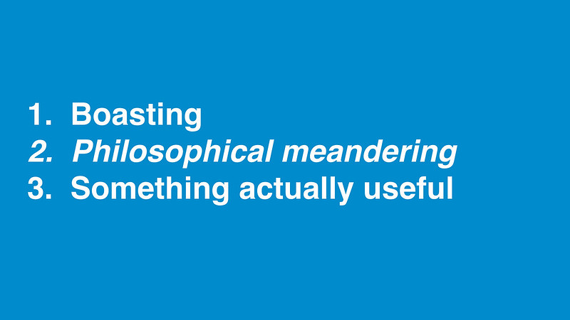
Then, as I go through the talk, I go back to this slide and make it clear where we are. Not at great length, don't beat them over the head with it. But enough to reassure people and help them remember where they are conceptually - and give them a clue about how much longer there is to go. Signalling you're conscious of their time is helpful.
As well as asking people to write big words on their slides we encourage them to write in 'whole thoughts' - sentences or headlines rather than chapter headings.
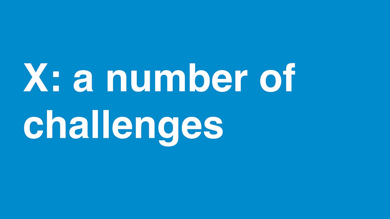
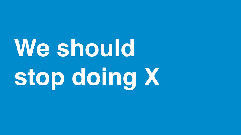
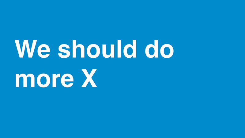
Let's imagine you're discussing the issue of 'X' in your organisation. You will quite often see a slide with a heading like this:
Or:
Or:

or simply:

They use the slide to introduce the subject and then discuss it in front of you.
This fits the criteria of being big and might qualify as being simple but it's not clear. And news people would describe it as burying the lede.
It's quite easy to get to the end of that discussion without knowing exactly where they stand on the subject of X. People immersed in their specialism often forget to state their assumptions.
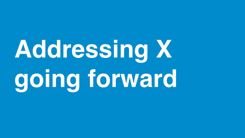
We would encourage, instead, writing a slide like this:
Or:
And then discussing the reasons, or enumerating them on subsequent slides.
This approach has a few advantages:
1. It forces you to say what you actually think
And means you can't get away with the common presentation trait of just listing all the things you know, without actually stating what you think should be done.
And, especially usefully in large organisations, it means you'll probably need to agree this with your colleagues before you say it to anyone else. Writing and agreeing presentations like this takes longer than the vaguer stuff but it's a way of making sure the organisation knows what it thinks and what it's saying - it's a tool for organisational thought.
2. It encourages everyone else to concentrate on the main thing
It's hard to leave a slide like this without either agreeing, disagreeing or fairly explicitly dodging the question. You certainly can't say you haven't been told. It discourages discursive rambling around the topic, though that still turns out to be possible. At the least, it tends to funnel the rambling towards agreement or otherwise.
3. It works on social media
Increasingly, when doing a public presentation, the most interesting and coherent slides end up on instagram or twitter. If nothing else it's a good discipline to think of your slides in these terms. Do they communicate on instagram, without you droning on in front of them?
One of the things I'm proudest of about GDS is that, most of the time, when you see one of us presenting, you can actually read our slides.
This is a big deal. It's hard to achieve than you'd imagine.
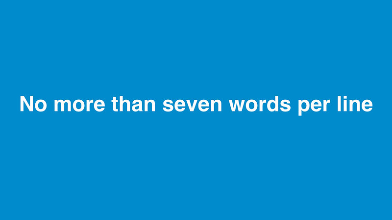
We have a few presentation 'rules', mostly observed most of the time, the important ones are these:
1. Nothing smaller than 36 point
2. No more than seven words per line
3. No bullet points
We do this for two big reasons:
So you can actually read it
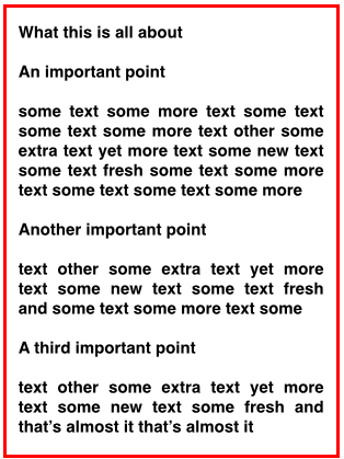
I absolutely hate it when someone stands up, points to a slide and says 'You won't be able to read this'. It happens all the time. I bet it's happened to you this week. It normally happens because:
a. People have cut and paste something from another format and haven't been bothered to rethink and rewrite.
b. People aren't actually writing a presentation, they're writing a report and they're going to take that report and project it onto a screen. If your job is to communicate a lot of detailed text or numbers don't do a presentation, don't project it on a screen, write a report and give it to people.
Often, in fact, what you should be doing is both. You should write a report and then use a presentation to guide people through the important bits. Adapt the same material to the media you're using and the situation you're in.* This is MORE WORK. I know that, I'm sorry, but it'll be worth it in the long run.
c. People who spend their life writing documents open a text box in a presentation tool and start writing in exactly the same way. You shouldn't do that. You're not writing an white paper, you're writing a poster. It's a different communicative task. Otherwise it's like playing tennis with a ping pong bat. Or something.
So people actually have to think about it
Shorten people's word count and they have to think harder about what they're trying to say. They can't just splurge the usual equivocal blah into a text box, they have to sharpen their point. This is a good thing. More on this tomorrow.
*I will admit that there's no productivity software that makes this easy to do. It feels like the big missing hole in 'office apps' - the notes field in presentation software isn't right. PDFs aren't right.