Russell Davies

As disappointed as you are
About | Feed | Archive | Findings | This blog by email

19-25

25

24

23

22

21

20

19

January 25, 2015 | Permalink | TrackBack (0)

simpler, clearer, Australia

Simpler_clearer_faster

Always nice when a bit of language proves useful:

"The DTO will use technology to make services simpler, clearer and faster for Australian families and businesses."

January 24, 2015 | Permalink | TrackBack (0)

The one and only

Vintage Ad #1,667: Which Sounds Better - A Sony Walkman or a Duck?


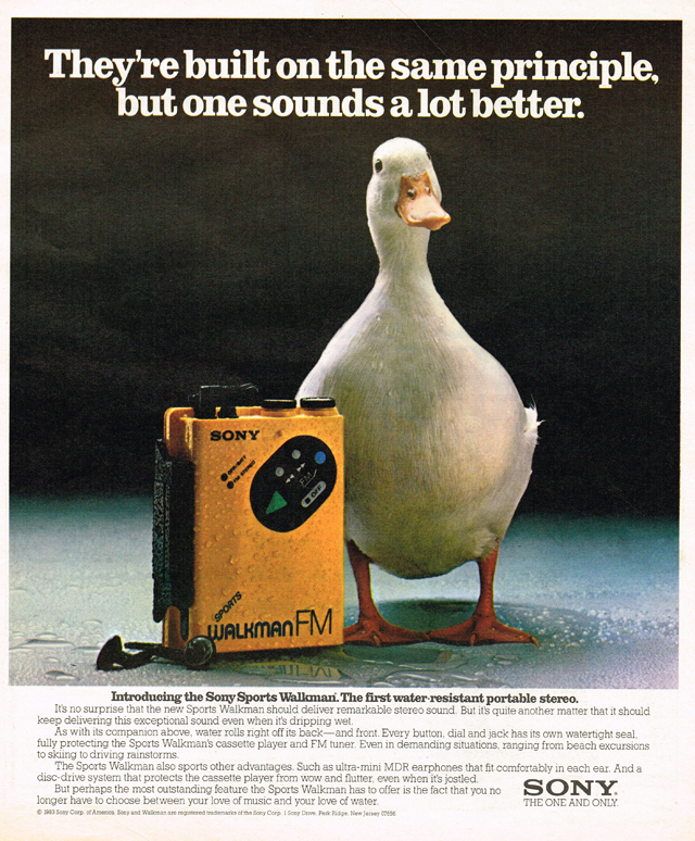
This swam through my feeds today. I don't remember ever wanting anything as badly as I wanted one of these. (The Walkman, not the duck.) Never happened. Maybe it's not too late.

January 23, 2015 | Permalink | TrackBack (0)

Are we sure this isn't just a numbers station?

Are we sure this isn't just a numbers station?

January 22, 2015 | Permalink | TrackBack (0)

Bayhem sublime

William Davies has written a fascinating piece about our relationship to 'Big Data':

"Common to both the charismatic leader and smart technology is their ability to evoke what Immanuel Kant described as the “sublime,” which, he argued, arises as a result of human cognition being utterly overwhelmed by an aesthetic experience. First we cower in terror, but then we quickly realise that everything is still okay. The discovert that the individual can survive, in spite of being overpowered, brings intense pleasure." 

He also quotes

"...historian Julian Stallabrass in “What’s in a Face? Blankness and Significance in Contemporary Art Photography,” a 2007 article on photographic portraiture. Noting a trend towards blank, expressionless but technically awe-inspiring photographs of human subjects, manifest in the work of Rineke Dijkstra among others, Stallabrass argues that:

subjective, creative choice has been subsumed in favour of greater resolution and bit depth, a measurable increase in the quantity of data. The manifest display of very large amounts of data in such images may be related to a broader trend in contemporary art to exploit the effect of the ‘data sublime’. In providing the viewer with the impression and spectacle of a chaotically complex and immensely large configuration of data, these photographs act much as renditions of mountain scenes and stormy seas did on nineteenth-century urban viewers."

I know this makes me appear terribly crass but that instantly struck me as a tremendous explanation of the appeal of Bayhem:

Michael Bay - What is Bayhem? from Tony Zhou on Vimeo.

That's what a Michael Bay film is : "human cognition being utterly overwhelmed by an aesthetic experience"

January 21, 2015 | Permalink | TrackBack (0)

Private / public

Private radio

We went to the World Snooker at the weekend. Was good. You could rent these little radios to listen to the whispering-in-the-background bit of the TV commentary, so you can hear what's going on but not disturb the play.

So you get this strange dynamic where some of the people there are connected by a secret audio channel, some people are in on a secret joke and some aren't.

For instance, while one of the players was lining up a shot someone in the crowd sneezed, and one of the commentators, in the ears of about a third of the people, said 'bless you' and a bunch of people did a little giggle. So, if you didn't have earphones, you'd have heard - sneeze, pause, giggle. With slightly strange timing. And every now and then, there'd be a joke on the commentary and a bunch of people would laugh and the players would wonder what was going on.

Not a big thing but an odd dynamic that you could probably work up into a reckon on Medium about social networks. Or maybe it's one for the analogy library. 

January 20, 2015 | Permalink | TrackBack (0)

How to live in a flat

How to live in a flat

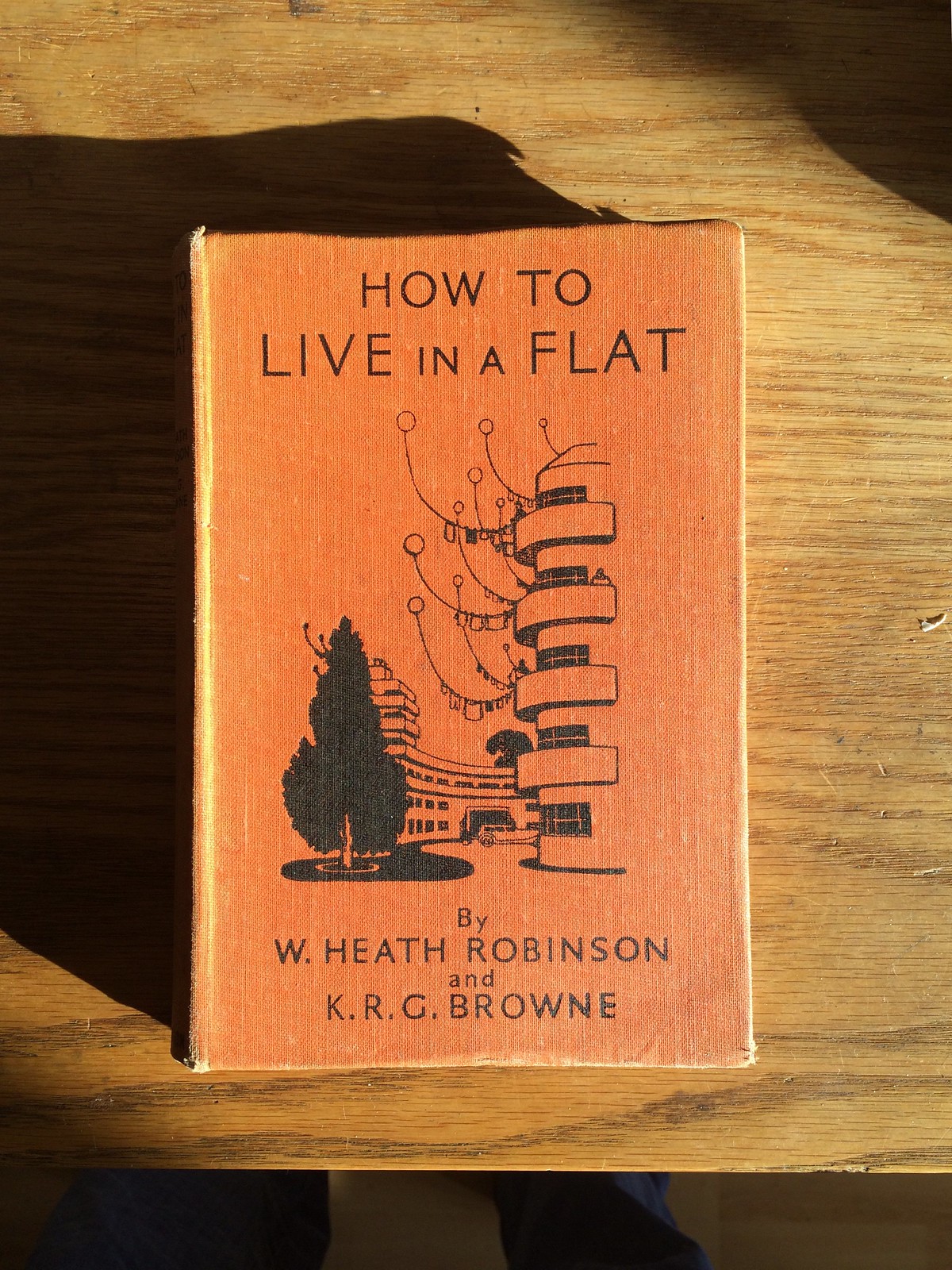
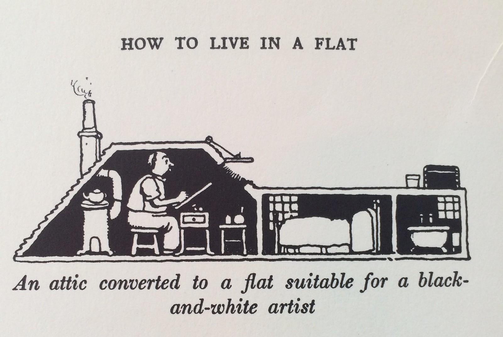
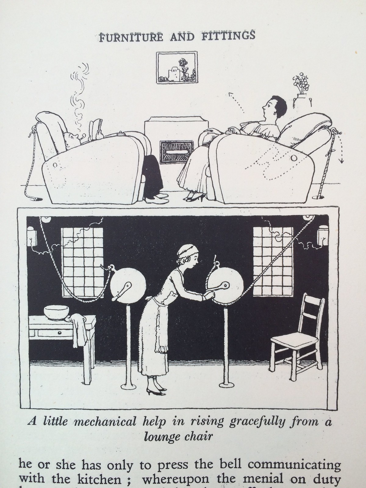
I went to see the Heath Robinson show at the Derby Museum, there's not loads there, it's a collection of drawings and prints from the William Heath Robinson Trust, but it's worth a visit. Hidden within the odd inventions are all sorts of nice little social observations. One of the drawings was from a book - How To Live In A Flat - which I remembered I had somewhere, so I dug it out. Excitingly, if you fancy a copy, looks like it'll be back in print soon.

How to live in a flat


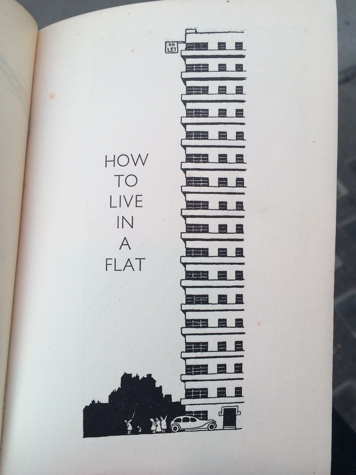
It's interesting to see a humourist looking at a form of architecture, and living, that's new. To see the collisions and blending between old and new that we're too distant to notice.

How to live in a flat

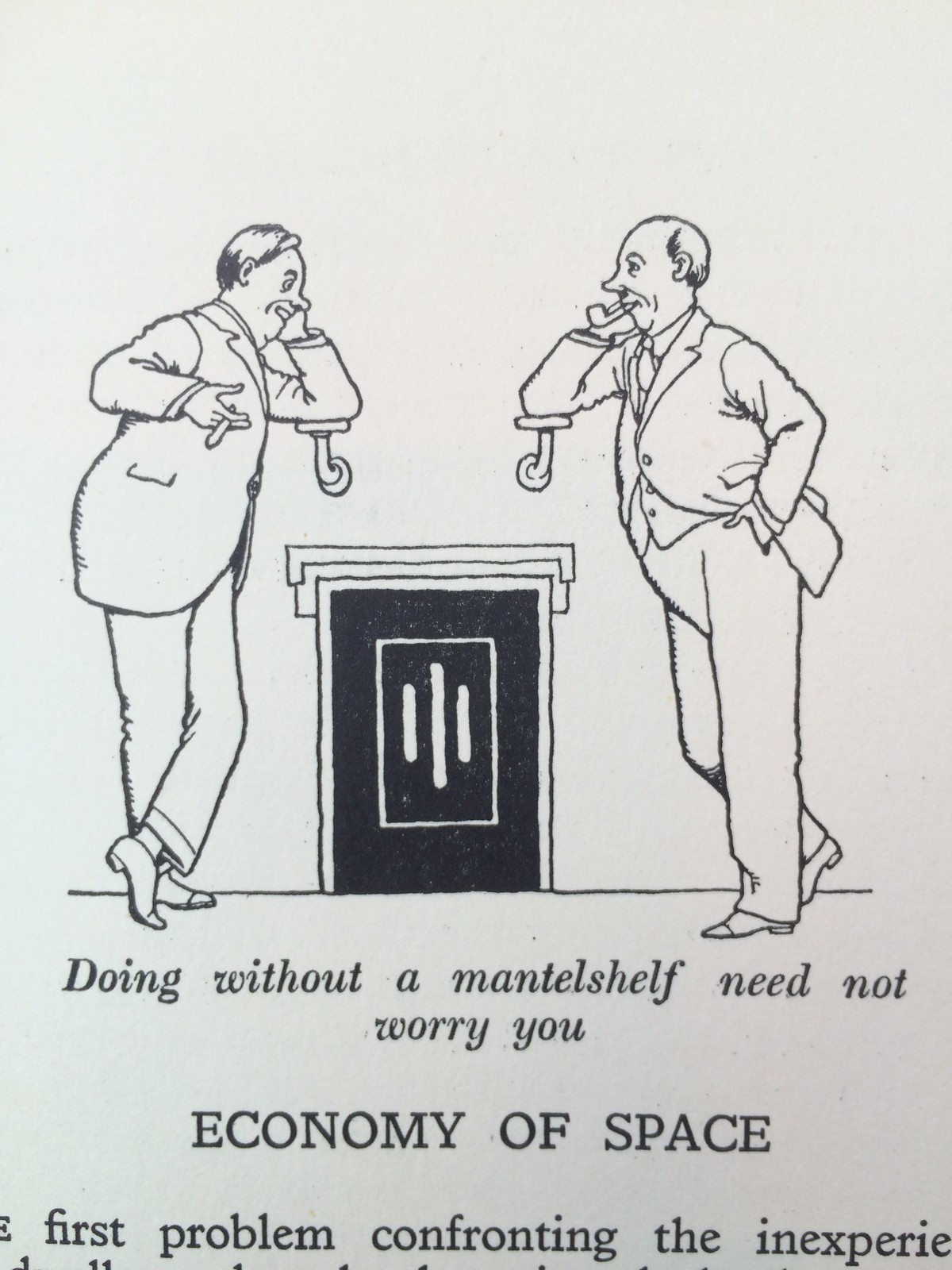
There are, for instance, at least two cartoons about the difficulty of living without a mantleshelf. And, while, it seems acceptable to live with less space, clearly no one is prepared to live without staff:


How to live in a flat

How to live in a flat

How to live in a flat

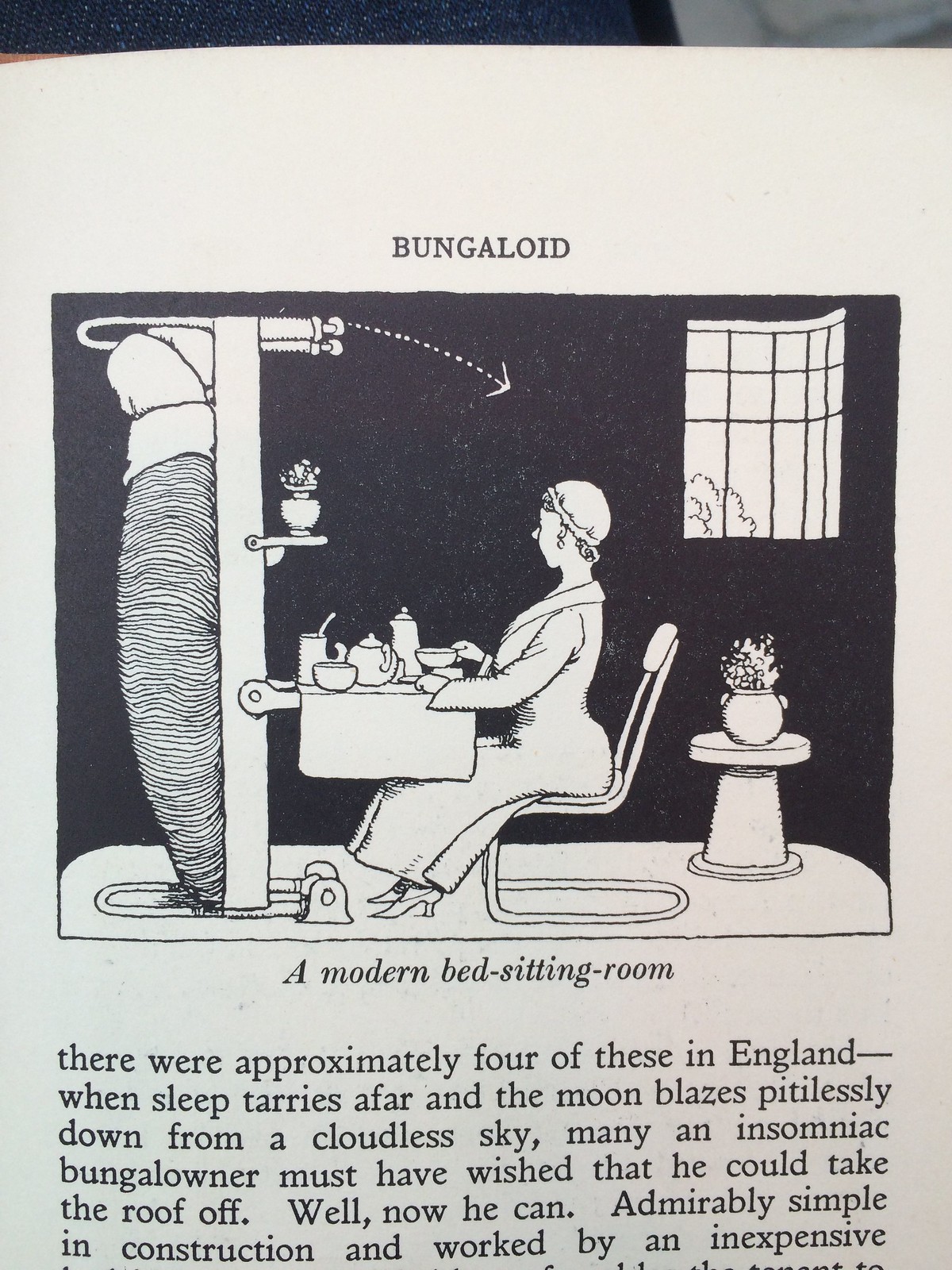
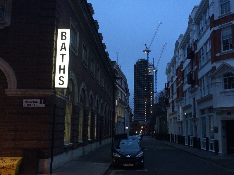
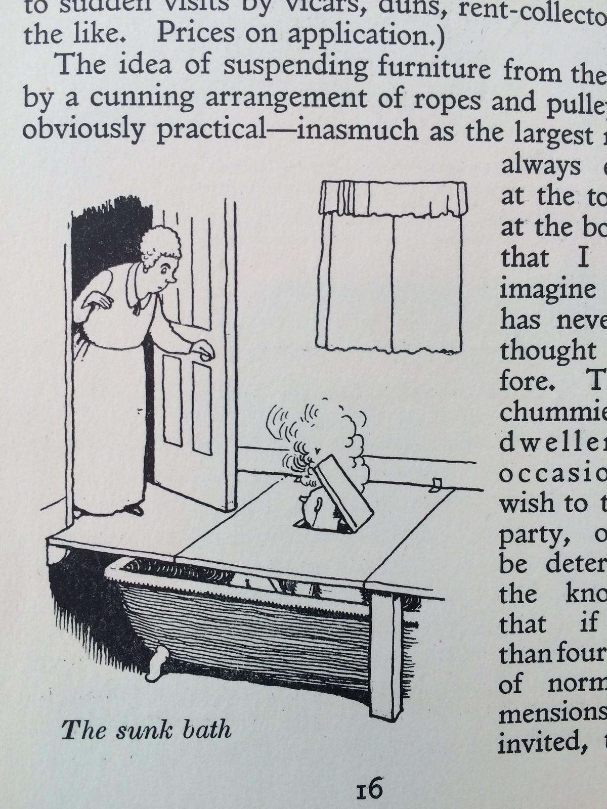
Similarly, there's a lot of ingenuity devoted to incorporating baths into a modern, space-contrained lifestyle, but there's no mention of showers. Presumably these were still beyond the pale: 

How to live in a flat

How to live in a flat

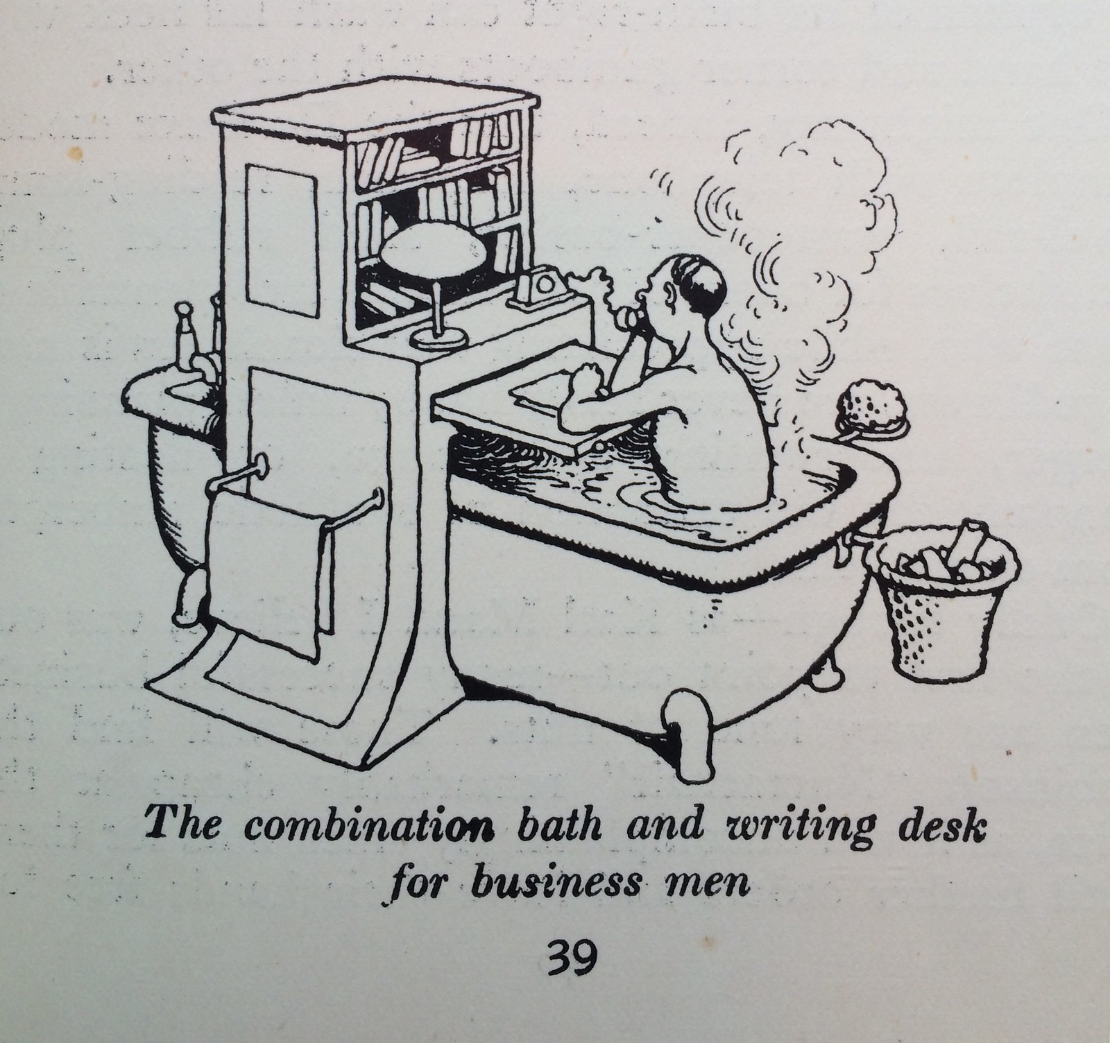
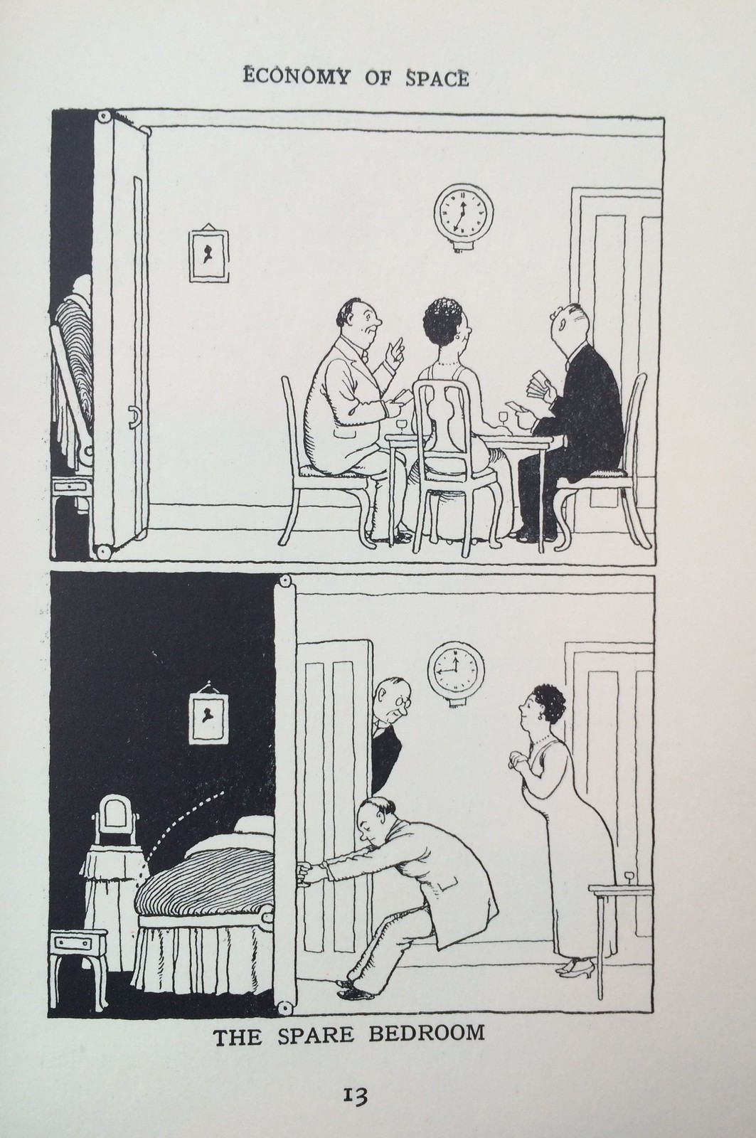
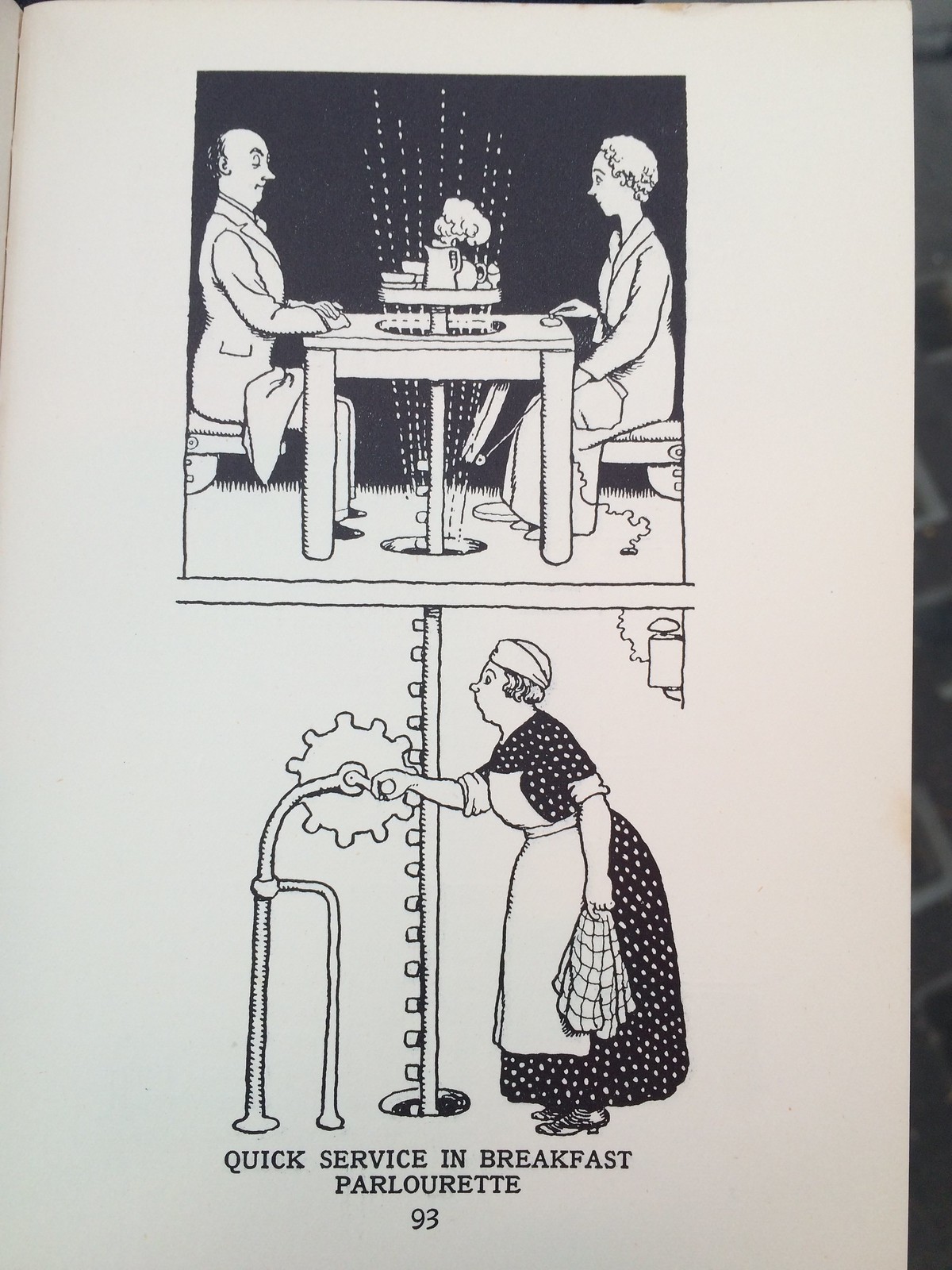
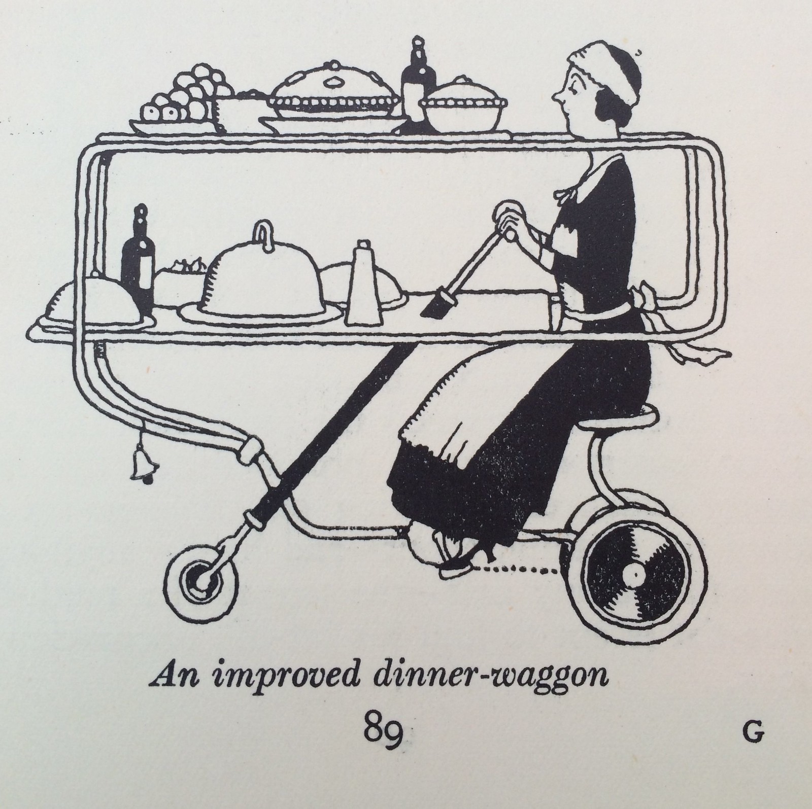
And then there are quite a lot of inventions that still seem contemporary and relevant, the kind of thing you'd find in next month's copy of Wallpaper or on a design tumblr

How to live in a flat

How to live in a flat

How to live in a flat

January 19, 2015 | Permalink | TrackBack (0)

12-18

18

17

16

15

14

13

12

January 18, 2015 | Permalink | TrackBack (0)

Talking of time and attention

Mark points to this. Specifically:

"But what’s most interesting, to me, are the assumptions baked into the Trending Topics algorithm in the first place. On the one hand, it’s perfectly fair — in fact, it’s perfectly necessary — to define ‘trends’ as brief ruptures of the ordinary. Spikes, you know, speak. But the algorithm’s assumption is also one that’s baked into the cultural algorithm of journalistic practice: We tend, as reporters and attention-conveners, to value newness over pretty much everything else.

Again, on the one hand, that’s absolutely appropriate — ‘the news,’ after all — but on the other, the institutional obsession with newness often impedes journalists’ ability to address the biggest issues of the day — the economy, the environment, the effects of the digital transition on global culture — within conventional narrative frameworks. Just as #OccupyWallStreet, in Twitter’s algorithm, competes against #KimKWedding, we pit the long-term and the temporary against each other, forcing them to compete for people’s (and journalists’) attention. We accept that the slow-burn stories have to fight for space against the shocking, the spiking, the evanescent.

Which is unfortunate, since the most important topics for journalists to address are often the ones that are the opposite of 'trending'."

January 17, 2015 | Permalink | TrackBack (0)

certification

Someone pointed to this idea recently. It's smart. When they issue insurance details they also send you a nice looking print, with the details on the back, the idea being you can display it and won't lose it.

That's good. But it made me think about a book I bought ages ago called The Art of the Market, it's about the style and beauty of share certificates - as graphic objects. They were intricate and elaborate to convey the weight and importance of the issuing company, to suggest great value and to make them hard to fake.

What would be even better with insurance details would be if the documents in themselves were beautiful and valuable, if the paper and the design conveyed their importance and, if necessary, explained their complexity.

That'd be good wouldn't it? If the last few generations of paper documents became collectable because they were beautiful.

January 16, 2015 | Permalink | TrackBack (0)

« Previous | Next »