"The organisers have never really explained why dullness, deference, lazy thinking and received opinion might not thrive just as well in a negative book review as a positive one; nor why a glowing notice by a good writer should not elude these pitfalls. To do so would be to expose the fact that “hatchet jobs” are in fact far easier to write than admiring reviews; or that what they are really after is a piece of humorous, well-turned spite (and nothing too wrong with that, either)."
Writing about good things is harder than writing about bad things. Especially if you want to be funny.
February 12, 2014 | Permalink | TrackBack (0)
APG Noisy Thinking: "Inspiration" Russell Davies – Planning Maverick from accountplanninggroup on Vimeo.
I wrote yesterday's blog post and then I remembered, I have done an experiment with presenting with multiple screens, sort of. And then I found it on the internet. This is one Keynote screen simulating various screens with different things going on. It was for an APG thing about - What Inspires You?
The screen technique is interesting, the content less so. And I'm not sure where the weird high-talking voice comes from, I don't usually do that.
Anyway.
(I think they've labeled it Planning Maverick because they have absolutely no idea what I'm going on about.)
February 11, 2014 | Permalink | TrackBack (0)
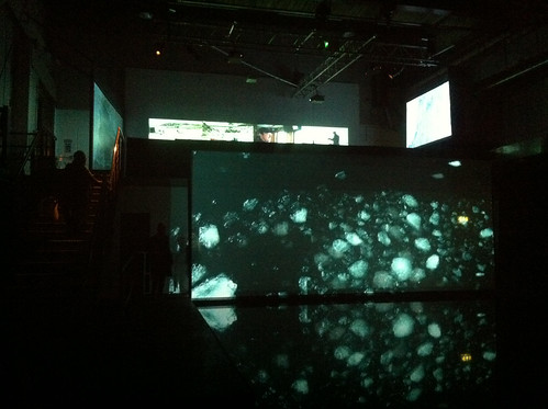
Matt was right. Out Of Ice was great. You've missed it now though.
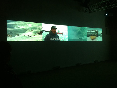
Reminded me of my deep need to try multiple projectors for a presentation - in an Eames style. Must do that sometime.
February 10, 2014 | Permalink | TrackBack (0)
I've had this cognitive tick for as long as I remember. I hate public wastes of attention - specifically verbose, obtuse signs, I'm always correcting them in my head, occasionally I collect them too.
An early example from Spitalfields in 2007:
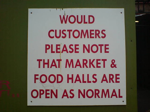
It could just say 'open'.
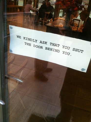
Or this, from yesterday. It could just say 'please shut the door' (you don't really need the please, but I don't mind a bit of politeness.)
On a slightly different tip, you see these all over town:
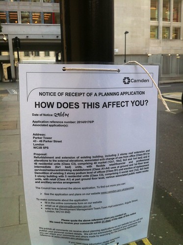
They're obviously making some minimal effort to engage people but the design of it is so opaque. How does WHAT affect me? What's the THIS? They've made the wrong bit big, and because that means that every sign looks the same from a distance you just don't look that closely. Ugh.
February 08, 2014 | Permalink | TrackBack (0)
February 05, 2014 | Permalink | TrackBack (0)
An exhibition in Glasgow all about Newspaper Club. Who'd have thought it?
February 04, 2014 | Permalink | TrackBack (0)