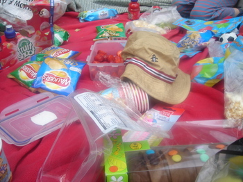
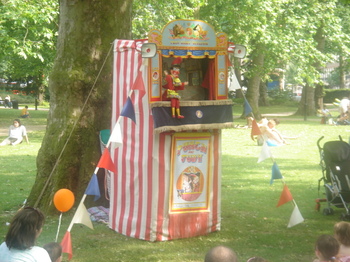
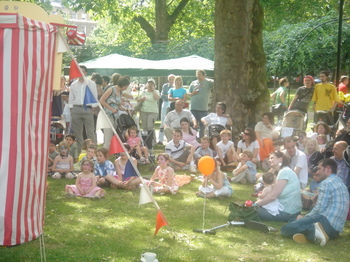
It was Arthur's birthday party today. We started off with bowling, which I can highly recommend for 6 year olds (they have ramps to aim and roll the ball down). Thence to Russell Square for picnic. And we were lucky enough to discover a Punch and Judy show going on. You can't beat an English afternoon when it's sunny.
Russell Davies
As disappointed as you are
About | Feed | Archive | Findings | This blog by email
summer fun
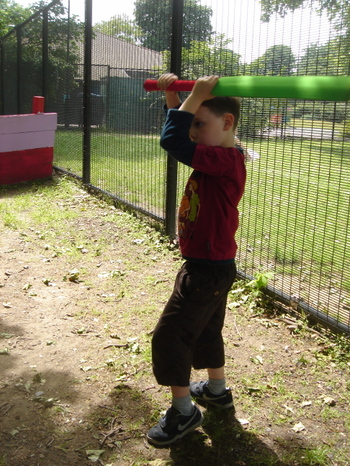
Arthur's starting to leave his Star Wars phase (it's been a couple of years) and enter a Justice League phase. His knowledge of the Star Wars oeuvre has been very useful for explaning all kinds of things, you can answer many six-year old questions by referencing the Force, the Empire and the Rebel Alliance. But I've got to admit, all his light-sabre training has done nothing for his cricket stance.
As someone at the park said today, summer is the time for junior cricket and the evocative sound of sponge on sponge.
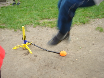
Back at the flats we discovered that the Stomp Rocket is an unusually effective toy for communal activity, which is normally so hard to manage. Arthur was very excited that lots of the other kids crowded around to play. Stomp Rocketry is nicely egalitarian in that almost everyone can get it to go pretty impressively high, so there's lots of wowing. And the heights are fairly randomly distributed so the bigger kids can't lord it over the others. Plus, there's a high rate of fire so you don't have to wait too long for your turn.
June 04, 2006 in diary | Permalink | Comments (0) | TrackBack (0)
a definition of happiness
Trees reflected in your tea. Here.
June 02, 2006 in diary | Permalink | Comments (1) | TrackBack (0)
read these books
I just finished reading Apex Hides The Hurt by Colson Whitehead which is a brilliant novel about a naming consultant. It's one of those books which makes you question a lot of the stuff you do every day while simultaneously giving you ideas about how to do it. I love the way it's set in the present but also seems to be in a slightly timeless, slightly disturbing Americana.
And it didn't really occur to me until I'd finished it, but Mr Whitehead also wrote The Intuitionist, which is similarly brilliant and odd, and concerns a fierce dispute between factions of elevator inspectors. On the one side there are Empiricsts, on the other, Intuitionists. It should feel familiar to planners and market researchers.
May 18, 2006 in diary | Permalink | Comments (2) | TrackBack (0)
bad looking data at media 360
I'm sitting in what feels like the 1000th presentation at Media 360 where someone apologises for the business or density of their data chart. Like bad data design is somehow inevitable, like a force of nature, like all you can do is put the numbers in to excel or powerpoint and tweak it a bit and that's all you can do.
There are other options. The point is to communicate.
Don't apologise for it, make it better.
Look at gapminder, or presentation zen, or information aesthetics or even that old curmudgeon Mr Tufte. Data can be communicative and beautiful, if you only think about it.
(Above is a nice, simple-looking chart from gapminder, which is even better because it's part of a useful, explanatory animation)
May 12, 2006 in diary | Permalink | Comments (2) | TrackBack (1)
